Technical analysis
Introduction to technical analysis charts
Charts are an essential part of any technical trader’s toolkit. Let’s examine how they work, the key types of technical analysis charts and how to read price action at a glance.
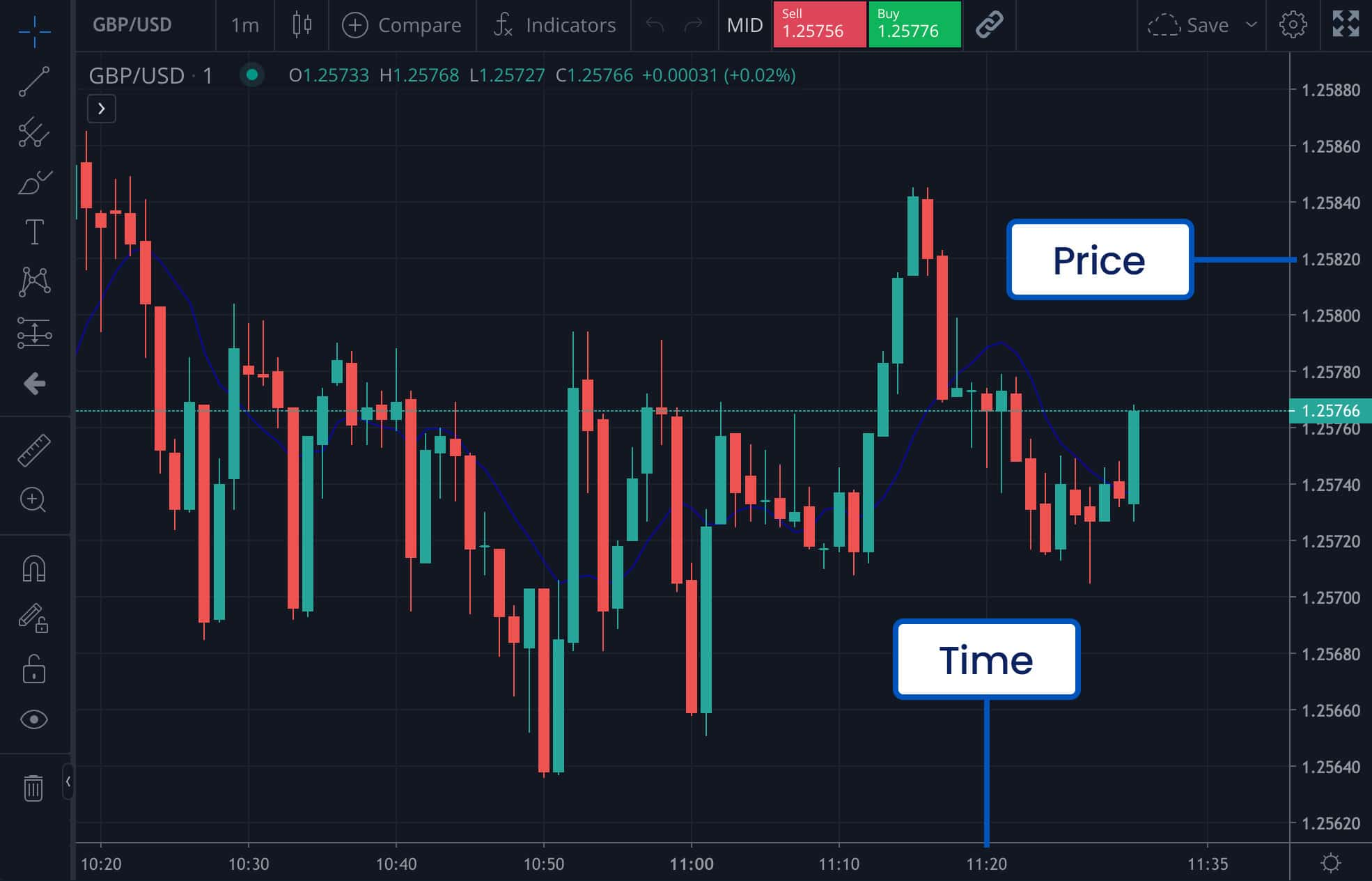
Price vs time
Any chart will always display price and time on its two axes.
- Time is on the x axis
- Price is on the y axis
In this way, a chart shows how a market’s price has changed over time.

You can pick how much time to show on your chart. For a short-term view, you could examine a five-minute or 60-minute chart. On a five-minute chart, each point will represent five minutes of price action.
But if you’re planning on position or swing trading, then you might want to look at something more long term – from a week, to a month or even a year.
Example - ten-minute EUR/USD chart
On this ten-minute EUR/USD chart, each candle represents ten minutes of trading activity.
On this weekly chart, each candle represents five days of trading activity.
You’ll also be able to decide which price you want to see on a chart. Most are set to the mid-price by default, but you can amend it to the bid (sell) or the ask (buy).
Types of technical analysis charts
There are three main chart types you can use: mountain, bar, and candlestick.
Mountain charts are essentially line charts. They show you the broad price movements of a market over a given period.
However, there’s a lot that mountain charts won’t tell you. If you’re looking at one with a 60-minute timeframe, for example, then each point it will only show the last price reported in every 60-minute interval. To see what happened in that time, you’d have to check to shorter-term chart.
Bar and candlestick charts give you much-needed extra insight. Both will tell you the highest, lowest, opening and closing prices of a market in a given period.
The only real difference between bars and candlesticks is how they look. Both give you very similar information.
Bars
Bars show price action as a series of straight lines, with two short lines coming off them.
Candlesticks
Candlesticks show price action as a wider body, with a ‘wick’ line coming off the bottom and the top.
In the Trading Academy, we’re going to focus on using candlesticks – they are the most popular chart type. But choosing between bars and candlesticks is really just a matter of preference. Try out both in your FOREX.com demo, and decide which makes it easiest to spot price patterns at a glance.
Advanced traders may also use more sophisticated chart types such as Heikin Ashi, Renko and point and figure charts. These can improve the isolation of trends and help predict possible future movements.
How to read a candlestick chart
Candlestick charts show price action using three distinct parts: the candlestick’s color, real body, and wicks.
Color
A candlestick’s color tells you whether the price action over the period was bullish or bearish.
- A green candlestick denotes upward movement – meaning that the closing price was higher than the opening price.
- A red candlestick denotes downward movement – meaning that the closing price was lower than the opening price.
You may also see uptrends represented by white candlesticks and downtrends depicted by black candlesticks.
Real body
The real body, meanwhile, tells you where most of the price action was. The top and bottom of the body show the opening and closing prices.
On a green stick, the market has opened lower than it closed. So, the bottom of the real body will show the opening price, and the top the closing. On a red candle, the opposite is true.
Upper and lower wick
Using the upper and lower wicks, you can see the market’s highest and lowest price over the trading period. The upper is the market’s high point, and the lower is its bottom price.
Using these three elements, you can tell a surprising amount about the price action within a period.
A candle with a long upper wick but a small body, for example, tells you that the asset rallied during the session – but was then pulled back close to its opening price. Or if a candle has no wick at all, then all the trading within the period was between the open and close level.


Technical traders believe that the patterns created by one or more candlesticks in a row can offer useful insights into where a market is headed next. This is covered in more detail in our Key candlestick patterns course lesson.


