
Yield curve inversion summary:
- The U.S. Dollar is the reserve currency for the world and U.S. Treasuries are the backbone of the global financial system.
- Treasury rates can be plotted based on maturity, and normally, that’s an upward sloping line with more risk (time) compensated by greater return (yield).
- This isn’t always the case, however, and when longer-term rates dip below shorter-term rates, the yield curve has inverted. This can take place at differing maturities and in different ways. The concept is further explored below.
- If you'd like to learn about this dynamic in real-time with live markets, I regularly discuss Treasuries and Yields in the weekly webinar. It’s free for all to register: Click here to register.
Imagine for a moment that you walk into your local bank, and you wanted to take out a loan. You ask for a short-term, three-month loan and the bank provides a quote of 5.3%, which sounds high. So, to get the monthly payment lower you inquire about extending the term, to two years instead of three months; and this time the bank provides a quote of 5.0%.
This sounds strange, as the bank is looking for a lower rate of return for an additional year and nine months of risk. Risk and return are supposed to go hand-in-hand, and this seems to be a clear illustration of that not being the case, where the shorter-term with lower risk is demanding a higher rate of return.
As a thought exercise, you decide to extend the term of the loan even longer, to 10 years, just to see what the bank says. And now they quote at 4.0%!
This is mind-blowing and now that monthly payment will be so much smaller than with the original three-month term that you’ll barely notice the repayment of principal over a 40x longer duration. You sign up and walk out of the bank grinning ear-to-ear.
Now, if you’re a customer, that probably sounds like a pretty good deal. And this doesn’t usually happen in practice because banks aren’t in the business of taking on poor risks. This is merely a thought exercise to illustrate somewhere that it does take place. But think of it from the perspective of the bank offering these lower rates for longer terms… is this a bank that you would want to invest in?
The risk management would be difficult to control as something is clearly mis-calculated, and like yourself, walking into the bank looking for a mere three-month loan you’ve instead taken on 10 years of risk. That additional nine years and nine months exposes yourself – and the bank – to a number of unknown perils. If you were offered these more favorable rates for longer-term loans and you jumped at it, what do you think other customers of that bank did? Probably the same thing… so the net result is the bank would be widening out the risk profile of their loan book simply by offering lower rates for longer-terms, taking on far more risk than they would otherwise want for a sub-standard rate of return.
Sure, perhaps you pay back the loan over the 10-year term and everyone walks away happy. But more than likely this won’t be the case for all of the customers taking that option as an additional 40x the term, spread over enough samples would probably dig deeply into that bank’s margins; and this is why it doesn’t happen in practice.
Where a similar dynamic does take place, however, is the world’s most important market of U.S. Treasuries. And, like the microeconomic example investigated above this is something that will carry impact across bank balance sheets. It’s a clear illustration of distortion, but perhaps more important is what it’s saying and that naturally evolves into the question of why anyone should care.
U.S. Treasury Yield Curve
The U.S. government operates on debt. This is handled by the U.S. Treasury department as new debt is issued each week, after which it trades on the secondary market and is vulnerable to the forces of drive from market participants. Each week, more debt comes online after which it’s available to trade in the secondary market. Individual investors can even participate in these auctions directly with the Treasury department at the TreasuryDirect website.
Snapshot from the TreasuryDirect.gov website

Chart prepared by James Stanley; image derived from Treasurydirect.gov
The Federal Reserve controls short-term rates only. So, if we’re setting Treasury maturities on a continuum based on time, the Federal Reserve’s control would be limited to the far-left end, as they only control overnight rates. Fed Funds, the rate that the Fed does control, often mirrors that of the four-week T-bill because, after all, we are looking at the same issuer with very similar maturities. On the below chart I’ve plotted Fed Funds in red and rates on four-week T-bills in blue.
Fed Funds (red) plotted with 1-Month T-Bills (blue)
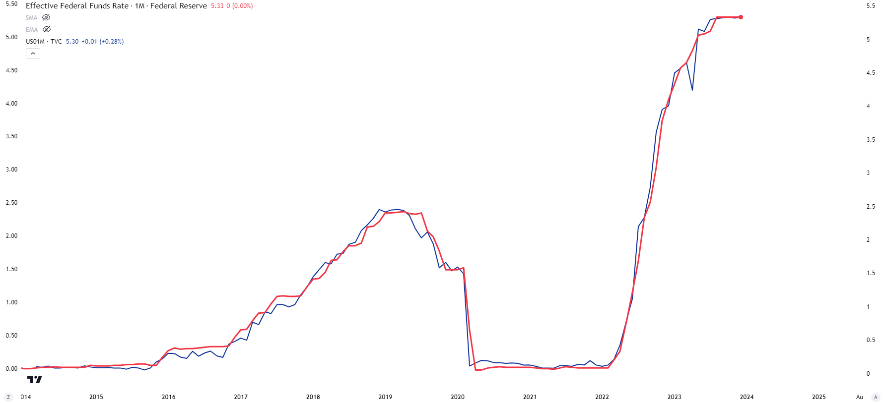
Chart prepared by James Stanley; data derived from Tradingview
The shortest-term offered from the U.S. Treasury department is the four-week Treasury Bill, followed by the eight-week, 13-week, 26-week and 52-week T-Bills. After that, with maturities between two and ten years, are Treasury notes and that’s followed by 20 and 30-year Treasury bonds. Auctions can be followed directly from the U.S. Treasury’s website, and investors can participate in these options through Treasury Direct.
Below is a screenshot from planned Treasury auctions, available from the U.S. Treasury website. You’ll probably notice that many of these offerings are for short-term bills and that’s often the norm.
U.S. Treasury Auction Schedule
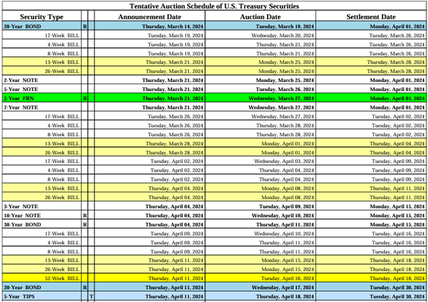
Chart prepared by James Stanley; data derived from U.S. Treasury website
Treasury Auctions Impact Yields but There’s More to It
Each week when new debt is auctioned off to the public, market participants can bid on each issuance and this can bring changes to the rates picture across the yield curve. But, after that auction, bonds trade on the secondary market where they are again vulnerable to the flow and drive of the market. And this is where matters begin to get more interesting.
Many will think of a bond and consider it a boring, slow type of investment. But rates can change very quickly on the secondary market and this is often emanating from larger macro flows. If, for instance, the Central Bank is talking up the prospect of rate cuts, that would mean that coupons on bonds auctioned in the future will be lower – and the higher-paying coupons that have been issued today would be valued at a premium in that instance.
If a Central Banker comes out in a public interview to state that they’re worried about the economy, and they are now considering lowering rates to help to produce growth, bond markets can act very quickly in pricing that in.
And because bond prices and yields share an inverse relationship, the very act of bond yields going lower can drive bullish demand in the bond itself. As prices go higher, the yield on previously-auctioned bonds would be softened due to this extra premium.
Let’s walk through a simple example to illustrate. Let’s say that you buy a 30-year Treasury bond with a 5% coupon at the auction, and you buy this at ‘par,’ or 100% of its principal face value. But, a year later rates have fallen and 30-year Treasuries are now yielding 4%. Well, your 5% coupon would offer an handsome alternative – would you just give that back to the market at par? Or – would you demand a premium? Right, this is markets and there’s profit motive so you would probably demand a premium.
The amount of that premium would mathematically align your bond – with a 5% coupon – to the current market structure (less a year of maturity as you only have 29 years as opposed to 30 years). The yield on your bond would likely be a touch inside of 4% due to the year that’s already passed: But there’s no reason that investor would pay anymore than what current market rates for Treasury bonds with 29 years left to maturity would be going for.
Because so much debt is in the marketplace Treasuries often align on the basis of Yield to Maturity, which includes both coupon payments and principal value and this is a key part of the Fixed Income relationship to understand.
Coupons v/s Principal
As noted above Treasury auctions often come along with a coupon based on the par value of a bond. For most Treasuries with maturities of two years or more, par is usually considered to be $1,000 per bond and a sale at 100% of par value would be $1,000, while 97% of par would be $970 for that $1,000 bond.
But – Treasuries inside of two years are often auctioned off as ‘zero coupon’ bonds which can help to provide some color to the structure. A 6-month T-bill, for instance, will not carry a coupon. Instead, it will sell at a discount and mature at par, or $1,000. So, if market rates are 5% for 6-month T-bills, the bond can be sold at 97.5% of par, or $975 per bond, and would then mature at $1,000. The investor would gain $25 from the time that they bought the T-bill and when it matured at par six months later. These ‘zero coupon’ bonds are incredibly popular and they similarly trade on the open market. Let’s say you buy the T-bill at the 5% annualized rate – and then rates get cut at the next Fed meeting two weeks later.
In that case, similar Treasuries with 5 months left to maturity would see value appreciate, and that can allow for a profit on the trade.
Or, alternatively, if the Fed announced a surprise rate hike that wasn’t expected, all of the sudden your bond is worth less as the Treasury will be auctioning off three- and six-month bonds with higher yields; so if you want to sell yours in the marketplace it will probably be worth less.
Bond prices move on the basis of macro-economic themes, and that impacts yields. But this is a very important relationship to understand if investigating the yield curve as it’s the dynamics at play that can allow for both opportunity and risk.
On the below chart, I’ve plotted ZN, which is a futures contract representing Treasuries with 10 years of maturity in red, with the 10-year yield in blue. I’ve also added a correlation coefficient to the bottom of the chart and you’ll notice that it sticks very close to -1.0, illustrating the inverse relationship that plays out across markets of price v/s yield. I’ve also highlighted a number of ‘inflection points’ or points where yield began to drop and futures prices started to rally, or, in the opposite case, where yield began to push higher and ZN futures began to sell-off.
When yields drop, that’s opportunity in long bonds. Or when yields rise, bonds can sell-off quickly.
10-Year Treasury Note Futures (red) plotted against 10-Year Yields (blue)
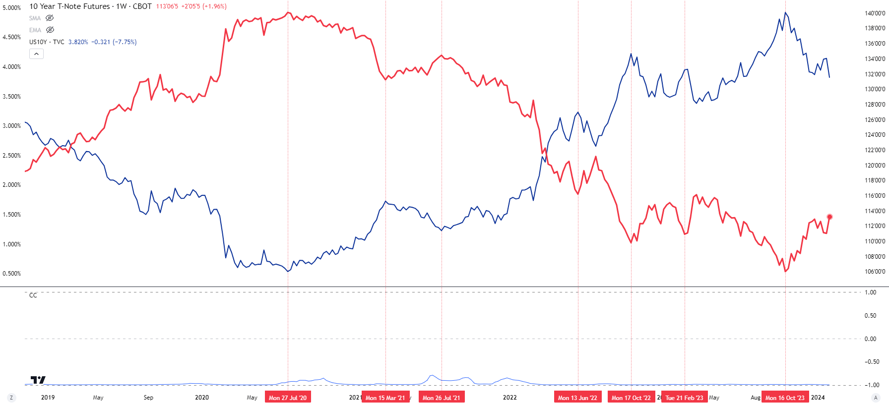
Chart prepared by James Stanley; data derived from Tradingview
The Yield Curve
Getting back to our earlier example – risk and return often go hand-in-hand. This is the same as going to a bank for a loan or diversifying a stock portfolio. And it also usually pertains to U.S. government debt, as well, but that’s not always the case.
For something like Treasuries, many risk factors are similar across the curve. So, whether it’s a 3-month T-bill or a 30-year Treasury Bond, the issuer is the same: The U.S. Government. When I was studying for the Series 7 (and I’m not sure if this is the case today as that was more than 20 years ago), I was taught that the one security that could be called ‘risk free’ was the U.S. Treasury bill, as the U.S. government had never defaulted on a dollar of their debt.
But if we go out two years, well now we’re introducing some unknown risk. Sure, odds would seem as though the U.S. would be able to honor debt obligations two years from now but as the past decade has taught us, things can change very quickly. But – what if we go out 10 years, or 20? Well, that’s even more unknown on the horizon, and for bond investors depending on the U.S. government to service their debt, that’s more risk and it needs to be accounted for.
So, like many other aspects of life the yield curve will often reflect this greater risk with more time to maturity as there’s simply more factors that could come into play that we don’t know about yet.
On the chart below, we’re looking at the U.S. Treasury Curve on March 31, 2021. You’ll notice the front-end, or shorter-term maturities are pegged near the floor and that’s due to the Federal Reserve’s stimulus that came into play after the Covid pandemic. But, as maturity goes out towards the ‘long-end’ of the curve, yields rise to, again, account for the additional risk of the unknown in the future.
U.S. Treasury Yield Curve on March 31, 2021
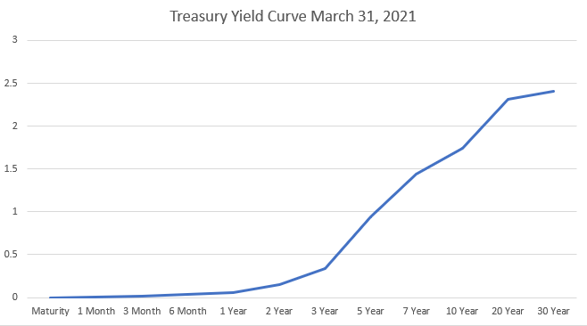
Chart prepared by James Stanley; data derived from Tradingview
In the above chart the 1-month Treasury bill had a paltry yield of only .01%, but the 30-year was carrying a return of 2.41% and that allowed for a yield spread of 2.4% from the 1-month to the 30-year.
This is a clear example of the additional risk of time being met by greater returns to compensate for that risk, and this is a normal yield curve. But, the yield curve isn’t always normal, and that’s what this article is about.
When the Curve Begins to Invert
The entire reason that I wanted to point out Treasury structure above is to highlight the fact that there’s profit motive in Treasury markets and that’s usually on the basis of changes in principal value. It’s not nearly as popular in the media as stocks and many retail traders often don’t know that this exists, but there’s a number of venues where investors can speculate on Treasuries.
If the Federal Reserve sees that inflation is picking up, and begins to fear of the economy overheating, they can begin broadcast that rate hikes may be on the way. The act of hiking rates is designed to draw capital out of the market and into investments, and as the Federal Reserve hikes short-term rates more and more capital can push into U.S. debt, which can also serve the function of ‘removing liquidity’ from other markets. As short-term rates push higher, so does opportunity cost as that short-term rate on U.S. Treasuries is the ‘risk free’ rate that market participants can gain simply from investing in U.S. government bonds.
This will often have some impact across the curve but the amount and the degree will be determined by the marketplace.
Going back to our prior example, we last looked at the yield curve as of March 31, 2021. At the time the Fed was fully engaged with both QE and rates were pegged to the floor. But, as the year progressed so did inflation and by the time we got to the December Fed meeting, the bank had started to warn that rate hikes may be on the way.
On the below chart, we’re now looking at the Treasury Yield Curve as of December 31st that year, and there was a large-move higher on the short-end of the curve with 2-year Treasuries jumping up to .736% yield from a prior .152% yield in March. But the longer-end of the curve actually saw rates dip, down to 1.91% from the earlier level in March at 2.41%. The yield spread had also contracted, as the difference between 1 month and 30-year Treasuries was now down to 1.845% from the earlier read in March of 2.4%.
U.S. Treasury Yield Curve on December 31, 2021
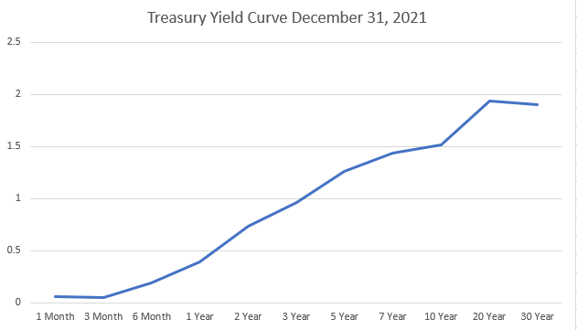
Chart prepared by James Stanley; data derived from Tradingview
Why Would Long-Term Rates Go Down When Short-Term Rates Go Up?
Well, again this draws back to the premise of speculation.
If market participants think that rates will inevitably move lower, they can buy longer-term bonds and wait for rate cuts. And given the greater maturity, there could be more of a potential move in the principal value given the extra time. If rates do go down – well then bonds would then be worth more given the price/yield relationship. And on the other side, if rates go up, well then those bonds would be worth less and perhaps even would show as an unrealized loss until it’s sold in the marketplace.
In this instance, due to the aggressive inflation that had shown there was already some speculation on the long-end of the curve that hardship may be ahead, and this helps to explain the dip in longer-term yields, from 2.41% on the 30-year on March 31st down to 1.905% on the same issue nine months later.
I’ve plotted both curves on the below chart to illustrate the changes that took place. The first curve that we looked at in March is plotted in blue, and the updated curve that we looked at for December 31st of that year is plotted in orange. As the Fed warned of rate cuts on the horizon, the short-end saw yields move up to reflect that. But market participants did not seem convinced of prosperity ahead as both 20 and 30-year yields dipped. And that led into a painful 2022 for equities.
U.S. Treasury Yield Curves Compared: March 31, 2021 to December 31, 2021
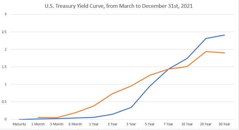
Chart prepared by James Stanley; data derived from Tradingview
Long Bond Principal Value
As an example of principal value moving in consideration with a change in rates, we can look at a related market to see the activity that showed from March into December of 2021. On the below chart, I’m looking the 30-Year Treasury Bond Futures Market (ticker: ZB) and we can see that there was a 10.56% move, trough to peak, over that same period of time. And this was as the Federal Reserve was warning that rate hikes would be on the way to address inflation, the impact of which becomes visible on the right side of that chart as prices fell down and yields shot up in 2022.
U.S. 30-Year Treasury Bond Futures (ZB)
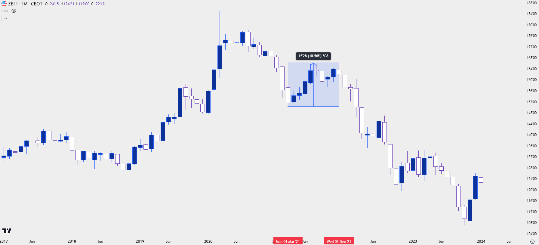
Chart prepared by James Stanley; data derived from Tradingview
When Curves Invert
If investors are bearish on the future there’s a few different ways to voice that trade. Sure, stocks could be sold short, but there’s some hassle with that. If it’s a direct short sale of equities there’s usually some borrowing costs to consider and then of course, the risk of markets running higher and evaporating your capital. There’s also the options market, where investors can buy puts that could prosper in the event of a falling market; but now there’s theta decay to consider and time is not usually on your side when long options, particularly for a long-term trade that may take time to begin working.
If you’re running a hedge fund and responsible for deploying capital into the market with the aim of the best risk-adjusted return, bonds can make for a really compelling option. Because if the economy is going into recession well then the Central Bank will likely be looking to cut rates and soften policy in effort of prodding growth.
Like mentioned above, higher rates are designed to slow the system by drawing capital away from riskier investments and into Treasuries. Rate cuts are the opposite, where there’s dwindling opportunity cost of being in ‘safe harbors’ and investors are increasingly incentivized to invest in higher-risk venues. This pretty much explains the role of QE in the post-GFC backdrop as low rates themselves weren’t enough to drive investment, the Federal Reserve had to go into the marketplace to buy bonds, which depressed yields and further made the prospect of storing cash in Treasuries as a less-attractive prospect. But that’s an article for another day.
If markets are seeing an increasing chance of a recession they can look to buy longer-dated Treasuries in anticipation of eventual rate cuts. The demand that emanates from that can push prices higher and yields lower until, eventually, the longer-dated bond begins to yield less than that of a short-term bond.
This is yield curve inversion, and it highlights distortion in the marketplace. It’s unlike our initial example, in which the bank just had poor risk management protocol that would likely lead to some eventual calamity. Instead, what yield curve inversion is highlighting is investor behavior anticipating what may happen in the future.
This is why yield curve inversion is often considered as an indication of possible pain ahead, and the obvious reason is the greater demand that’s shown in long-term debt as opposed to shorter-term debt. But the central point at which these two forces meet are rate expectations.
If market participants are bullish and optimistic, there’s often a number of attractive venues to deploy capital. But, if they’re growing more bearish and pessimistic, then those additional options can soon lose their luster, and the safe harbor of a Treasury bond with a relatively safe yield can begin to look attractive. It’s when those capital flows begin to really push on the long-end of the curve that things can start to get interesting.
Treasury Yield Curve Inversion
Coming from a bond market background I’ve always tracked the 2-10 spread as signs of inversion. It’s simple, and it compares two very different issues of the 2-year and 10-year Treasury that still share quite a bit of similarity, with only eight years of difference in maturities.
But as this curve inverted and started to bring on grumblings of possible recession the Federal Reserve highlighted that they’re focused more on the spread between the 10-year and the 3-month T-Bill. There’s an entire section at the New York Federal Reserve website dedicated to this, with the headline of ‘The Yield Curve as a Leading Indicator,’ which is explained in the sub-heading as ‘This model uses the slope of the yield curve, or “term spread,” to calculate the probability of a recession in the United States twelve months ahead. Here, the term spread is defined as the difference between 10-year and 3-month Treasury rates.’
New York Federal Reserve: The Yield Curve as a Leading Indicator
Also on the New York Federal Reserve website is a historical snapshot of the 10-year/3-month spread going back to 1982. I’ve ran the below chart into 2022 so that we can get a 30-year snapshot, and it’s plotted with recessions as the shaded areas in the background.
You’ll notice that each prior instance of inversion was followed by a recession. It wasn’t always lock-step, and it wasn’t always immediate, but the distortion highlighted by an inverted yield curve eventually led to a recessionary backdrop in each of the instances shown on the chart below.
10-Year/3-Month Treasury Spread with Recessions as Shaded Areas
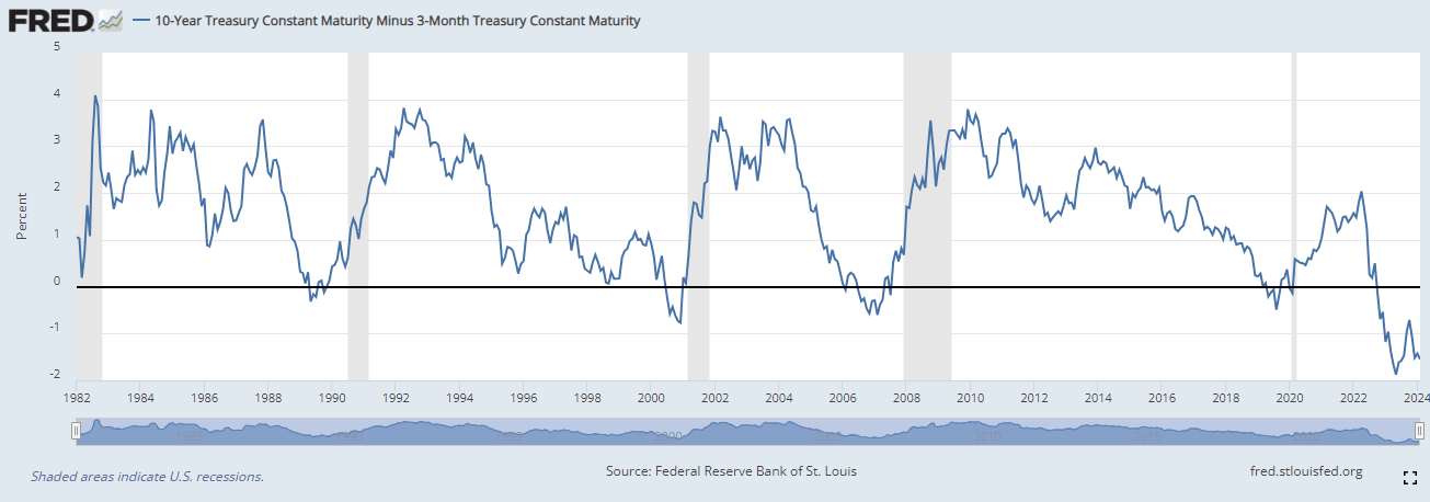
Chart prepared by James Stanley; data derived from Federal Reserve Bank of New York
Other Factors of Consideration
As noted earlier, the Fed only controls ultra short-term rates while longer-term rates are determined by the marketplace. But there’s another player in this equation and it’s something that I spoke to earlier in this article, and that’s the U.S. Treasury department. If you remember the spreadsheet we looked at with the planned Treasury auctions, this is a factor of importance for market participants in those maturities.
Treasury markets are supply and demand-based, so if the Treasury does want to boost long-term yields, they can sell more long-term bonds. This can effectively serve to steepen the yield curve, as greater supply of 20 or 30-year debt would lead to lower prices, which would then elevate yields. And the expectation around those shifts can create reverberations in the market.
The U.S. Treasury department announces their plan for debt issuance each quarter in their Quarterly Refunding Announcement. The QRA took on importance in July and October of last year. In July, the Treasury warned of more debt being auctioned on the long-end of the curve, and this led to a fast move-higher in longer-term yields. This also helped to push a very strong theme of strength in the U.S. Dollar as the currency then went on to 11 consecutive weekly gains, which is somewhat rare as it’s only happened a handful of times over the past twenty years. This also led to equities selling off and a lot of concern about U.S. debt sustainability.
With that push-higher in long-term yields, there was also a move towards normalization in the 10-year/3-month treasury spread. The 10-year yield gained while the 3-month held flat, allowing for a move towards ‘less inversion.’ But – this also came along with pain for equities as shown in the chart below. That shifted in late-October around the next QRA, and that coincides with the recent low in the S&P 500. On the below chart, I have the weekly variation of the 10-year/3-month spread plotted in red, with the SPY ETF represented as a blue line.
U.S. Treasury 10-year/3-month spread (red) with SPY (blue) – Weekly Chart
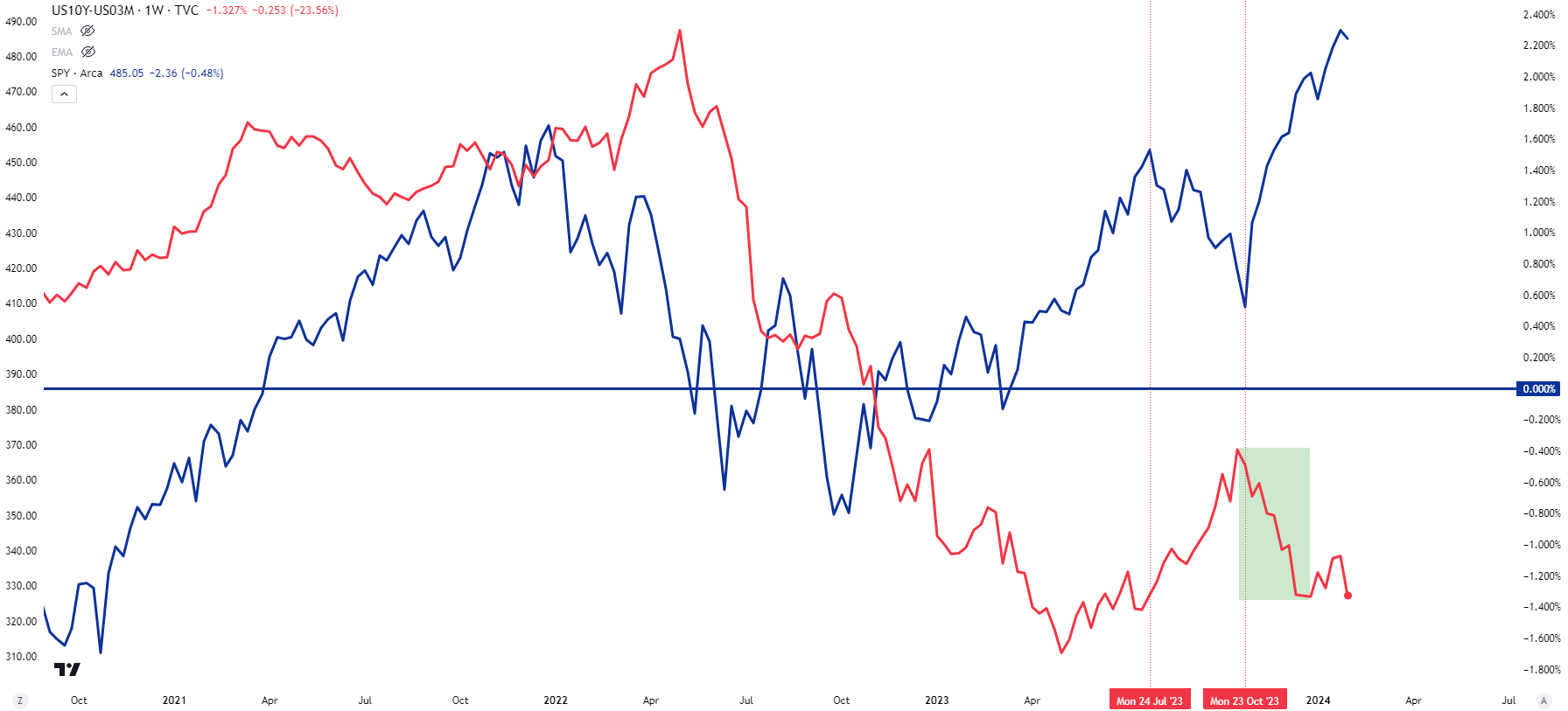
Chart prepared by James Stanley; data derived from Tradingview
Frequently Asked Questions (FAQ)
Why does yield curve inversion matter?
Yield curve inversion matters because it highlights distortion in one of the world’s most important markets. With globalization tying the world economy together more than ever and with the U.S. representing the reserve currency, and considering the debt load of the U.S., there’s significant consequence that can be drawn from moves in these markets. And when we are seeing enough activity that investors and hedge funds and traders are willing to accept a sub-standard rate to take on more risk, there’s probably a reason as to why. Yield curve inversion highlights that but it doesn’t provide enough feedback on its own to be a timing variable.
What’s the biggest challenge of trying to work with yield curve inversion?
Timing, and that’s pretty important to traders. Yield curve inversion can last for a long time and as looked at above, the curve can even normalize before a recession shows up. Given the small sample size there’s a number of qualifications that need to be made, and this is why I want to exude the importance of drawing contextual factors only as opposed to being a driving force of strategy. Yield curve inversion highlights distortion and that distortion could possibly lead to a number of other items, like recessions or bear markets, etc. But, the timing behind that is far from perfect, even in the small sample size that we do have available.
Does Yield Curve Inversion mean that a stock market sell-off is on the way?
This is where we need to disclaim the sample size. The fact of the matter is that there haven’t been enough of these episodes to scientifically say that an inverted yield curve will definitely lead into a bear market, or a recession or any other type of calamity. The fact is that it has in the past and logically it makes sense as to why it could given those relationships. But, like many other things in the field of speculation there’s no guarantees and, instead, I would like to shift the focus on the distortion presented from the scenario in effort of devising strategy.
And just from the data presented in this article, and at the time the 10-year/3-month spread remains inverted as it has been for more than a year now. The Federal Reserve’s own research highlights how they look at that as a leading indicator for recessions, yet in July of last year Jerome Powell said that the Fed was no longer expecting a recession.
So, it’s a probability that can be factored into the equation, but it should not be seen as the sole variable of market direction, on its own.
Does Yield Curve Inversion mean that a recession is on the way?
From the Fed’s research they’ve noted a relationship but, again, this is small sample size so it’s something that we should be careful with.
But perhaps more to the point the problem is timing, and I refer back to that chart that I shared from the NY Fed above, with the shaded areas indicating recession. In some cases, it took more than a year for a recession to show after the curve had normalized; and others, the recession had begun while inversion was still showing.
How can investors or traders easily follow the U.S. bond market?
There’s a number of mechanisms for doing so. In this article I referred to futures markets but there’s also Exchange Traded Funds that can similarly show bond market dynamics.
As we looked at earlier the 10-year yield established its recent high in October of last year at 5%, after which yields dropped quickly. And as yields dropped, prices rose, and this can be seen in the below chart of TLH, which is an ETF representing Treasury bonds with 10-20 years of maturity. As yields dropped from October into the end of 2023, TLH rose by as much as 18.91%.
TLH Weekly Price Chart
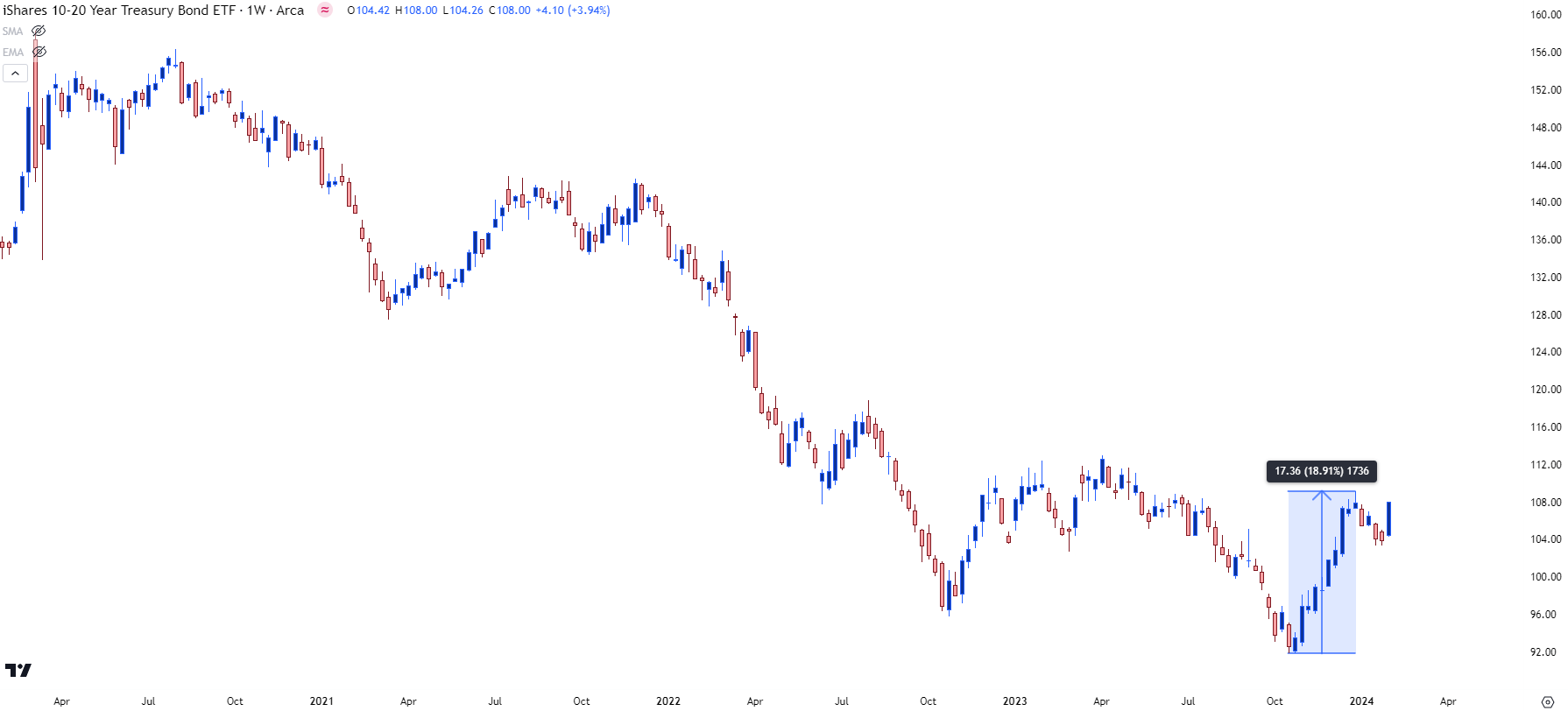
Chart prepared by James Stanley; data derived from Tradingview
As we discussed in the article, more time to maturity can lead to larger moves in principle given a similar move in rates. Another popular vehicle for tracking bonds via ETFs is ‘TLT,’ which represents U.S. Treasury bonds with 20 years of maturity or more.
Plotting that same move looked at above in the longer-term variant shows a similar move with similar timing, but TLT was up as much as 23.22% over the same period of time.
TLT Weekly Price Chart
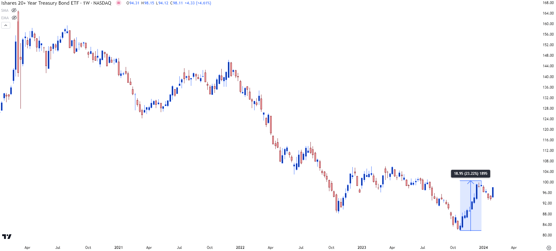
Chart prepared by James Stanley; data derived from Tradingview
--- written by James Stanley, Senior Strategist


