S&P 500 Finishes Off Election Gap as 10-Year Yields Jump After FOMC Cut

20231218 - 001 - 01
NA-meet-our-team-James-Stanley-125x125
By :  ,  Sr. Strategist

S&P 500 Talking Points:

  • The S&P 500 gapped-lower to start this week, continuing last week’s sell-off in the first week of 2025 trade.
  • U.S. Treasury yields have continued to rise and given the move there, compared to prior episodes of similar scenarios, stocks have held up relatively well, all factors considered. Perhaps the larger concern is the fact that the rise in longer-term yields is happening quickly amidst a backdrop in which the Fed has continued to sound dovish, even with U.S. data remaining positive such as we saw at the Friday NFP report.
  • The big item for this week is CPI data, set to be released on Wednesday. If that comes out hot, we can further see rate cut odds around the Fed get priced-out and that could justify an even larger pullback in equities.
  • To get my 2025 Forecast for stocks, the link below will allow for access.

Get our exclusive guide to index trading in 2025

Stocks continue to pullback in early-2025 trade and the first week of the New Year was a red week for the S&P 500, as the index shed almost 2% despite only being open four days with Thursday’s memorial in honor of former U.S. President, Jimmy Carter.

While the move in stocks goes against the recent grain, it’s the move in bonds that’s perhaps even more notable. Yields on 10-year Treasuries touched another fresh yearly high to start this week and that brings the move from the September lows to a whopping 120 basis points. That’s a change of 33% and it’s happened despite the FOMC going in the other direction of cutting rates.

This is perhaps disconcerting to a degree, as higher Treasury yields act as a buffer for stocks in a couple of different ways. Higher long-term borrowing costs make corporate operations more challenging as interest rates on debt are higher; and it also presents an opportunity cost for capital in the market, as investors can now get a higher rate on an investment in a bond rather than chasing stock prices that have been rallying from the Q4, 2022 lows.

There’ve been similar episodes of this in the past two years: Treasury yields were spiking higher in Q4 of 2022 and they topped right around the time that stocks had bottomed. As yields fell, stock prices began to rally and that continued into the next summer.

At that point, another jump in yields started to negatively impact equity prices and the 10-year briefly traded at 5% in 2023, right around the time that stocks hit their yearly low. And once again, as yields came down, stock prices shot higher.

And then last year, as U.S. data remained strong in early-2024 trade, 10-year yields rose and this buffered the advance in equities; but after the 10-year yield topped at 4.74% and as yields fell, equities rallied.

On the below chart, I’ve added SPX as a line chart behind the candlestick chart for 10-year yields, and notice that the relationship is not perfectly inverse. It’s as if there’s a point where rising yields eventually get the attention of equity market participants and have created a backdrop for pullbacks. And it appears that we’re at a similar junction right now.


US 10-Year Yields, SPX (Line Chart)
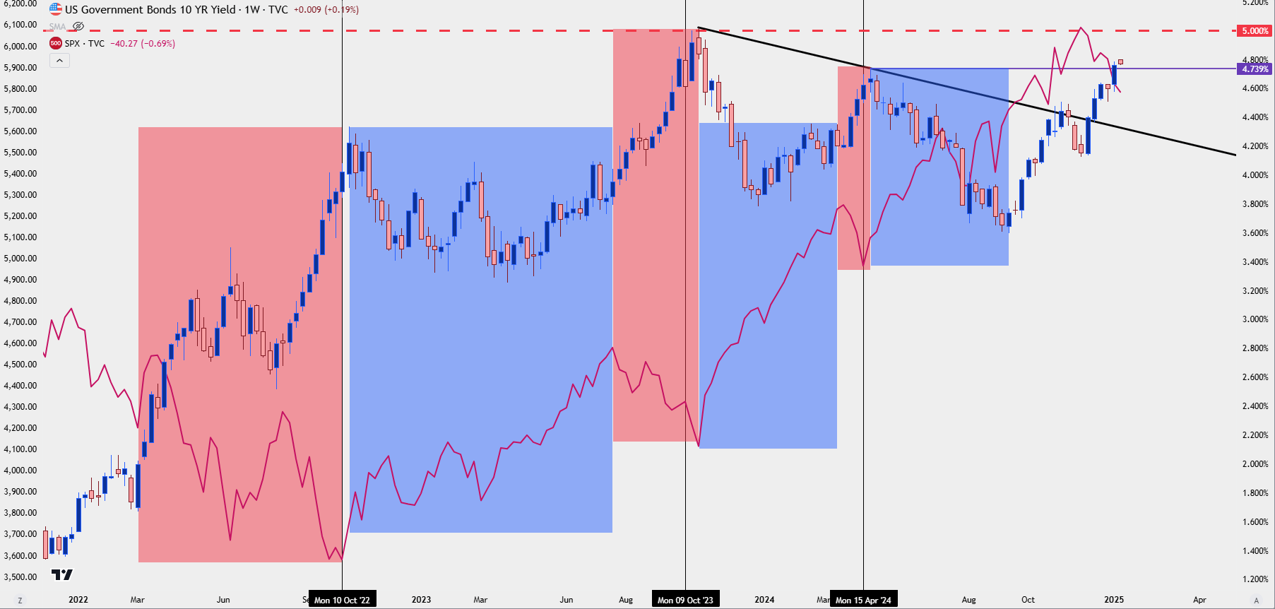
10 year yields spx 11325Chart prepared by James Stanley; data derived from Tradingview


Treasury Yield Curve Inversion (and Normalization)


One of the difficult aspects of a relationship such as what was looked at above is the fact that it’s imperfect. On that chart, there are periods of both rising 10-year yields and rising stock prices – the relationship does not show as a perfect inverse relationship that holds for a long-term. So it makes it easier to dismiss, especially for newer traders.

But there’s another aspect to this, and it’s the yield curve which is in the process of steepening right now as longer-term yields move higher and shorter-term yields have been guided lower by FOMC rate cuts.

As I discussed in the article on yield curve inversion, it’s the normalization of the curve that can often be a hindrance for equity gains. The Federal Reserve tracks the yield curve as a ‘leading indicator,’ and from their own website you can peruse research that highlights how this can be seen as a leading indicator for recessions.

The simple act of longer-term debt yielding more than shorter-term debt highlights a massive distortion in the marketplace but it’s not necessarily that distortion that brings the problem, as much as rectification of that distortion. As you can see from the Fed’s research, it’s after the curve has started to normalize that recession has followed, and that, of course, is something that can further act as a hindrance to stocks on top of the two factors noted above.


Federal Reserve Bank of New York – The Yield Curve as a Leading Indicator


SPX Near-Term


In this year’s forecast I shared my opinion on the matter, where stocks looked richly valued and given the post-election move in both the U.S. Dollar and equities, there was a backdrop for a possible pullback.

I also looked at stocks as my top trade idea for 2025, but after a pullback.

So the natural next question is whether the pullback is over or whether the approximate 5% move off the highs (as of this writing) has run its course.

And the real answer is that it’s too early to tell, especially given the trend in yields which hasn’t yet shown confirmation of topping. On the below chart, I’m looking at the same analysis around SPX that I had shared in both the forecast and the top trade for this year, and you’ll notice that the first support zone, marking the gap from the U.S. Presidential election, has now been filled. So on a longer-term basis that could start to open the door for bounce scenarios.

But the bigger question at this point is whether sellers have more in store, and what I’m watching for that now on an intra-day basis is the top of this week’s open gap, which runs up to the Friday close of 5,827. If sellers can hold a short-term lower-high, to go along with this morning’s lower-low, focus then shifts to the next support zone down, plotted from the 5,638 Fibonacci extension up to the 5,669 prior swing-high.

If bulls can close the weekly open gap and maintain strength, I’m then going to look for shorter-term resistance at the top of the election gap and a spot of prior support of 5,864. That then opens the door for a higher-low at 5,827 and with it comes the prospect of bigger picture bullish themes.

But – for now, this morning has produced a lower-low and the fundamental environment hasn’t yet shown any notable shifts, so there’s still the prospect of bearish control until price action shows otherwise.


SPX Daily Price Chart
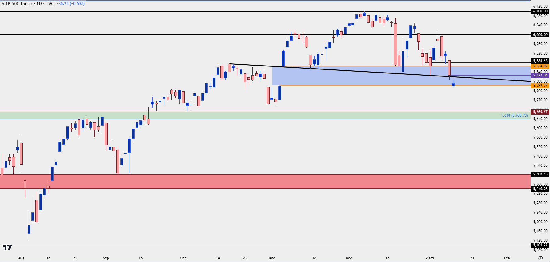
spx daily 11325Chart prepared by James Stanley; data derived from Tradingview


--- written by James Stanley, Senior Strategist


S&P 500 Talking Points:

  • The S&P 500 gapped-lower to start this week, continuing last week’s sell-off in the first week of 2025 trade.
  • U.S. Treasury yields have continued to rise and given the move there, compared to prior episodes of similar scenarios, stocks have held up relatively well, all factors considered. Perhaps the larger concern is the fact that the rise in longer-term yields is happening quickly amidst a backdrop in which the Fed has continued to sound dovish, even with U.S. data remaining positive such as we saw at the Friday NFP report.
  • The big item for this week is CPI data, set to be released on Wednesday. If that comes out hot, we can further see rate cut odds around the Fed get priced-out and that could justify an even larger pullback in equities.
  • To get my 2025 Forecast for stocks, the link below will allow for access.


Indices AD


Stocks continue to pullback in early-2025 trade and the first week of the New Year was a red week for the S&P 500, as the index shed almost 2% despite only being open four days with Thursday’s memorial in honor of former U.S. President, Jimmy Carter.

While the move in stocks goes against the recent grain, it’s the move in bonds that’s perhaps even more notable. Yields on 10-year Treasuries touched another fresh yearly high to start this week and that brings the move from the September lows to a whopping 120 basis points. That’s a change of 33% and it’s happened despite the FOMC going in the other direction of cutting rates.

This is perhaps disconcerting to a degree, as higher Treasury yields act as a buffer for stocks in a couple of different ways. Higher long-term borrowing costs make corporate operations more challenging as interest rates on debt are higher; and it also presents an opportunity cost for capital in the market, as investors can now get a higher rate on an investment in a bond rather than chasing stock prices that have been rallying from the Q4, 2022 lows.

There’ve been similar episodes of this in the past two years: Treasury yields were spiking higher in Q4 of 2022 and they topped right around the time that stocks had bottomed. As yields fell, stock prices began to rally and that continued into the next summer.

At that point, another jump in yields started to negatively impact equity prices and the 10-year briefly traded at 5% in 2023, right around the time that stocks hit their yearly low. And once again, as yields came down, stock prices shot higher.

And then last year, as U.S. data remained strong in early-2024 trade, 10-year yields rose and this buffered the advance in equities; but after the 10-year yield topped at 4.74% and as yields fell, equities rallied.

On the below chart, I’ve added SPX as a line chart behind the candlestick chart for 10-year yields, and notice that the relationship is not perfectly inverse. It’s as if there’s a point where rising yields eventually get the attention of equity market participants and have created a backdrop for pullbacks. And it appears that we’re at a similar junction right now.


US 10-Year Yields, SPX (Line Chart)

10 year yields spx 11325Chart prepared by James Stanley; data derived from Tradingview


Treasury Yield Curve Inversion (and Normalization)


One of the difficult aspects of a relationship such as what was looked at above is the fact that it’s imperfect. On that chart, there are periods of both rising 10-year yields and rising stock prices – the relationship does not show as a perfect inverse relationship that holds for a long-term. So it makes it easier to dismiss, especially for newer traders.

But there’s another aspect to this, and it’s the yield curve which is in the process of steepening right now as longer-term yields move higher and shorter-term yields have been guided lower by FOMC rate cuts.

As I discussed in the article on yield curve inversion, it’s the normalization of the curve that can often be a hindrance for equity gains. The Federal Reserve tracks the yield curve as a ‘leading indicator,’ and from their own website you can peruse research that highlights how this can be seen as a leading indicator for recessions.

The simple act of longer-term debt yielding more than shorter-term debt highlights a massive distortion in the marketplace but it’s not necessarily that distortion that brings the problem, as much as rectification of that distortion. As you can see from the Fed’s research, it’s after the curve has started to normalize that recession has followed, and that, of course, is something that can further act as a hindrance to stocks on top of the two factors noted above.


Federal Reserve Bank of New York – The Yield Curve as a Leading Indicator


SPX Near-Term


In this year’s forecast I shared my opinion on the matter, where stocks looked richly valued and given the post-election move in both the U.S. Dollar and equities, there was a backdrop for a possible pullback.

I also looked at stocks as my top trade idea for 2025, but only after a pullback.

So the natural next question is whether the pullback is over or whether the approximate 5% move off the highs (as of this writing) has run its course.

And the real answer is that it’s too early to tell, especially given the trend in yields which hasn’t yet shown confirmation of topping. On the below chart, I’m looking at the same analysis around SPX that I had shared in both the forecast and the top trade for this year, and you’ll notice that the first support zone, marking the gap from the U.S. Presidential election, has now been filled. So on a longer-term basis that could start to open the door for bounce scenarios.

But the bigger question at this point is whether sellers have more in store, and what I’m watching for that now on an intra-day basis is the top of this week’s open gap, which runs up to the Friday close of 5,827. If sellers can hold a short-term lower-high, to go along with this morning’s lower-low, focus then shifts to the next support zone down, plotted from the 5,638 Fibonacci extension up to the 5,669 prior swing-high.

If bulls can close the weekly open gap and maintain strength, I’m then going to look for shorter-term resistance at the top of the election gap and a spot of prior support of 5,864. That then opens the door for a higher-low at 5,827 and with it comes the prospect of bigger picture bullish themes.

But – for now, this morning has produced a lower-low and the fundamental environment hasn’t yet shown any notable shifts, so there’s still the prospect of bearish control until price action shows otherwise.


SPX Daily Price Chart

spx daily 11325Chart prepared by James Stanley; data derived from Tradingview


--- written by James Stanley, Senior Strategist


Open an account in minutes

Experience award-winning platforms with fast and secure execution.

Web Trader platform

Our sophisticated web-based platform is packed with features.
Economic Calendar