US Dollar, Nasdaq, SPX, Treasuries Talking Points:
- It’s been a fast shift in Q4 as the quarter started with rising fear and falling stock prices. But October saw the US Dollar bullish move stall and as Treasury rates have eased, hope has returned.
- At the November 1st FOMC rate decision, Chair Powell said that rate cuts weren’t even in the conversation, but since then we’ve seen markets build an expectation for even more cuts next year while also pricing out the expectation for any additional hikes.
- I’ll be discussing these themes in-depth in the weekly webinar on Tuesday at 1PM ET. It’s free for all to register: Click here to register.
Things can change very fast in markets, and we’ve been witness to that this year which comes on the heels of a 2022 that saw considerable change of its own. At issue throughout this process has been the FOMC driving a rate hike cycle in effort of stemming runaway inflation that resulted from a combination of fiscal and monetary stimulus.
But it was just about a year ago that hope began to enter the equation and 12 months later, we’re still looking for confirmation. Inflation remains stubbornly high on some fronts with the most recent US CPI report showing core inflation still at 4%. But – other metrics have shown considerable softening and the most recent headline CPI print came in at 3.2%.
When hope initially sprang into the equation in November of 2022, headline CPI had printed at a whopping 7.7%. But and this is an important ‘but,’ inflation had started to soften from the 9.1% that was released in July or the 8.5% that was released in August, and this gave hope that, perhaps, the Fed may be nearing the end of that rate hike cycle.
Given the importance of interest rates, such a change, from a hawkish stance favoring hikes into a dovish stance pondering cuts, could bring massive reverberations in numerous asset classes when this shift does actually happen. To date, the Fed has seemed to avoid the topic of rate cuts as they’re cautious for multiple reasons.
On the below chart, we’re looking at headline inflation releases since January of 2021, and notice how the data point is getting closer to the 2% level. There was a bounce in this indicator that began in August and continued through September and held through October. But with headline CPI making a move-lower in the data released in November, this has again sprung hope that, perhaps, the Fed may be nearing complete.
US Headline CPI Releases since January 2021 (indicative)

Chart prepared by James Stanley; data derived from Tradingview
Rate Probabilities Price Out Future Hikes
There was remaining expectation for the possibility of one more hike this year. Powell even remarked at the last FOMC rate decision that this could happen. But markets have run since then and at this point, there is scant expectation for any additional tightening.
At the one remaining meeting in 2024 markets are currently assigning a 0.2% probability of another 25 basis point hike, so about a 1-in-500 chance. The same 0.2% probability for 25 bps of hiking remains for January and that goes down to 0.1% for March. By June of next year, however, there are no expectations for rates to be higher than where they’re at today, and only a 17.2% probability that they will be at current levels.
Going out to December – and markets have wide expectations for multiple cuts next year, with a 29.3% probability looking for a full four cuts next year with Fed Funds finishing 2024 at 4.25-4.5%.
FOMC Rate Probabilities To December 2024
 Chart prepared by James Stanley; data derived from CME Fedwatch
What Does This Mean for Markets?
Market participants don’t usually wait around. We’ll often see anticipation build ahead of a widely awaited theme or event, and a possible pivot at the Fed has been no different. That conversation has been going on for more than a year now, and even though core CPI remains at double the Fed’s targeted level, that building hope for a pivot may not calm anytime soon.
The first market to investigate for a falling rate backdrop is bonds, and we’ve already seen some of that anticipation build since the November 1st FOMC rate decision, and to a lesser degree, even before that. Treasury yields have been on a wild ride this year as driven by those expectations around the Fed.
But – it is important to remember – the Fed controls Fed Funds, which is an ultra short term rate, and rates for Treasuries are determined by market participants, as given from supply and demand. To be sure there will often be a link but that’s not always the case, and there can even be times, such as we have now, where long-term rates are below short-term rates.
This yield curve inversion is generally sign of distortion and, in cases, can be a manifestation of bearish prognostications. Why else would investors accept lower rates to take on more risk? If one-month treasury bills are yielding 5% but 30 year treasuries are yielding 4.5%, why would any rational person accept 50 basis points in a lowered return to take on an additional 29 years and 11 months of risk?
There’s another reason – and that’s the prospect of falling rates, as a falling rate backdrop can boost bond prices.
So in that environment, a bond can be attractive from a couple of angles, as buying a bond before yields fall allows the investor to lock in a higher rate; while also enjoying principal appreciation in the event that rates do get cut.
From that scepter, it’s no wonder that market participants have been bidding bonds after major psychological points have been met. Last year, it was around 4.25% that bond bulls loaded into the 10 year, and this pushed yields on the benchmark down by more than 100 bps.
This happened again a few weeks ago, when the 10 year traded at 5% for the first time since 2007, and that only lasted for a few hours as bond bulls loaded in the trade and this pushed yields lower. Then there was another boost around the FOMC rate decision, with market participants running with the idea that the Fed had finished hiking.
We can see that still-bullish trend in 10 year yields on the below weekly chart. There’s remaining support potential around prior resistance, the same ~4.25% that stalled the move last year. But, while we’re on this chart I also would like to draw your attention to the green box on the left, which spans from November 2018 into March of 2020. That was the last rate cut cycle from the Fed and, perhaps that can give us a clue of what might be on the road ahead.
US 10 Year Treasury Yields – Weekly Chart (indicative)
 Chart prepared by James Stanley; data derived from Tradingview
Bonds Can be Attractive from Multiple Fronts in a Falling Rate Backdrop
As noted above, Treasury bonds can be especially attractive in a falling rate backdrop and there’s two big reasons for that: Locking up higher yields before rates fall further, and the opportunity for principal appreciation as the inverse relationship between bond prices and yields puts upwards pressure on prices.
But, there’s another factor and that’s the ability to avoid stock markets in an environment that might not be all that attractive otherwise. If the Fed is cutting, there’s usually a reason for it and that usually has something to do with growth. And if growth is lacking, then corporates can have a more difficult road ahead. If the Fed feels the need to begin cutting rates earlier than anticipated, lets say March, for instance, the question will be what has them so frightened that they had to loosen rates earlier than anticipated?
If we start to see stocks shaking as yields are falling, investors all-of-the-sudden have a choice to make: Try to ride out the volatility in equities or seek out the safer harbors of a US Treasury Bond or Note, which may actually appreciate in that slower growth type of scenario.
As a case in point, we can refer back to that green box on the above chart. This is around the Fed’s last cutting cycle that took place in 2019, but really the build of expectation for those cuts started in late-2018. Ten year notes had hit a high of 3.25% ahead of that episode, and then ran down to a low of 0.35% as the pandemic was getting priced-in.
That fall in yields came along with a strong jump in prices on 10 year Treasury notes, and on the below chart I’m looking at the ZB future contract, which represents 10 year notes. From the November 2018 low up to the March 2020 high, prices jumped by as much as 47.23%. That was but a single anecdote, but a clear indication of how falling rates can motivate bond bulls.
This is the principal portion only – not including yields. But we can see here where a Treasury bond can clearly trade in a manner more similar to a stock in a falling rate environment.
ZB – 10 Year Treasury Note Futures (indicative)
 Chart prepared by James Stanley; data derived from Tradingview
The X-Factor for Treasuries
This isn’t necessarily a new item but it is something that remains important. Whether the Fed is talking about another 25 bps of tightening or not, this should have little impact to the long-term scenario as in either case, hike or not, we’re probably near the peak for this cycle.
But, going back to the earlier point, Treasury markets are controlled by supply and demand. And the US government continues to spend, as famed Hedge Fund manager Stanley Druckenmiller said just a few weeks ago, ‘like a drunken sailor.’ This means more debt and more debt means more supply; and this also happens to align with when the US has considerable debt coming due next and this will be re-cycled by issuing more debt to pay off that maturing debt. And that debt is probably going to be issued at higher rates than it was initially issued at, which puts US debt service at even higher levels, which further raises questions of creditworthiness and sustainability.
This is where geopolitics can take on a stronger role because its relationships with trade partners that can help to find more willing buyers for that additional debt. But when those partners are also crimped with higher inflation, that can present a demand conundrum for all the debt that’s expected to come online next year. And if demand isn’t there? Well, more supply would dictate lower prices, and even higher yields. And this is likely one of the reasons that yields have continued to run higher after the July breakout.
So expecting bonds to have bottomed here (or yields to have topped) can still be a dangerous trade as the supply side of that equation is going to remain in flux next year as the Treasury increases their debt offerings. Again, this is at least partly behind the theme of higher yields from the April low, in which the 10 year moved all the way from 3.25% to 5.0%.
US 10 Year Treasury Yields – Daily Chart (indicative)
 Chart prepared by James Stanley; data derived from Tradingview
What Does This Mean for Stocks?
Falling rates can trigger a bull market in bonds, and if that shows up, there could be an attractive point for capital to flow away from equities. This seems to run counter to the widely held expectation that rate cuts favor equities; but that may be missing a point.
Low rates can be beneficial for corporates, as it incentivizes investors away from lower-yielding bonds and towards higher growth potential in equities. After all, this was part of the design of QE, to help motivate investors to take on more risk by holding rates at artificially low levels. It also makes for a more forgiving backdrop for corporates as companies can borrow at low rates and this simply allows for more breathing room, especially for small caps or tech-heavy companies. Again, this made sense while at the lows during the GFC.
But the actual act of rates falling presents a bit of opportunity cost as investors can not only avoid the pain of whatever might be showing from the slow-growth backdrop, but there’s also profit opportunity if rates do fall and Treasury prices do run.
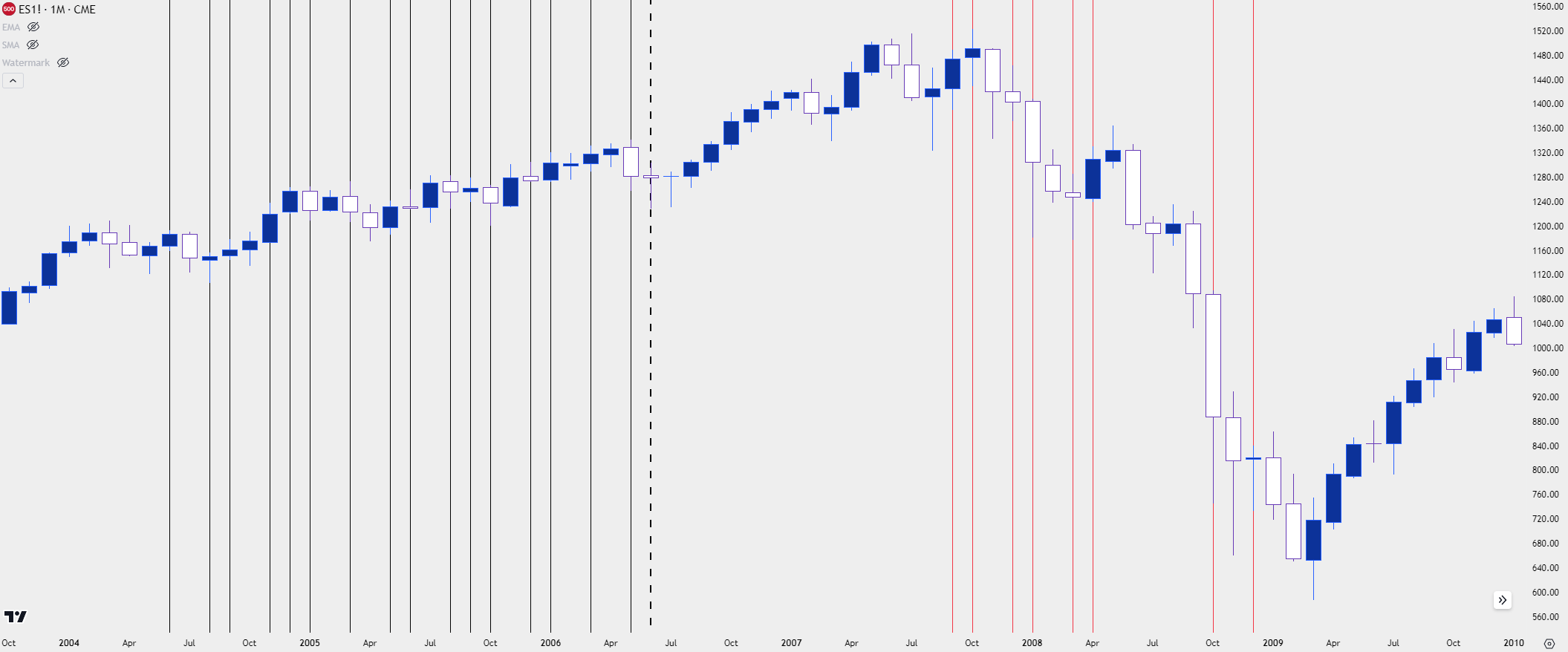
As a case in point, the below chart looks at the S&P 500 from 2004 through 2010. This was a hiking cycle that turned into a cutting cycle, and I’ve added black lines for each month in which the Fed hiked, and red lines for each month that the Fed cut.
Notice how the series of rate cuts did little to arrest the sell-off, in the same way that rate hikes were met with continued strength in stocks. Stocks even gained after the initial rate cut of that cycle and started to turn despite the loosening monetary policy that was taking place in the background. Once rates were held low for a few months (because rates were at the floor and could not be cut any more), equity prices began to rally, and we haven’t revisited those lows since.
S&P 500 Monthly Chart 2004-2010 (indicative)
 Chart prepared by James Stanley; data derived from Tradingview
S&P 500, Nasdaq into EOY, 2023
In late October I had written on the topic and as I shared then, I believe there remains the potential for a ‘Santa Rally’ into the end of the year.
The logic behind that assertion was that it didn’t look as though the Fed wanted to rock the boat, and while yields were surging at the time, nothing had seemed to have broken yet. This speaks to the black swan and this is something that can often pop up in those surging rate environments. This is what happened during the hiking cycle that ran into the year 2000, which led to the tech boom becoming the tech bust, and then the same with the housing collapse showing after a strong run in rates in 2007, with 5.25% ultimately being that ‘top’ level for the 10 year.
For this episode there were scares, to be sure. A year ago, there was trembling in the crypto market, which to this point looks to have been contained – to some degree. And then, of course, we had the shaking in regional banks in March which similarly threatened to unsettle the mood; but the world has since stepped back from the proverbial ledge and banks haven’t yet created a cascading domino effect, either.
This speaks to the ‘soft landing’ scenario from the Fed; but it also seems to miss a part of that equation, which is once rates start falling and once the Fed signals that the next move is a cut, matters can shift very, very quickly.
But, it does not appear that we are there yet. So, stocks have done what they’ve done most of the time since the GFC came into the equation.
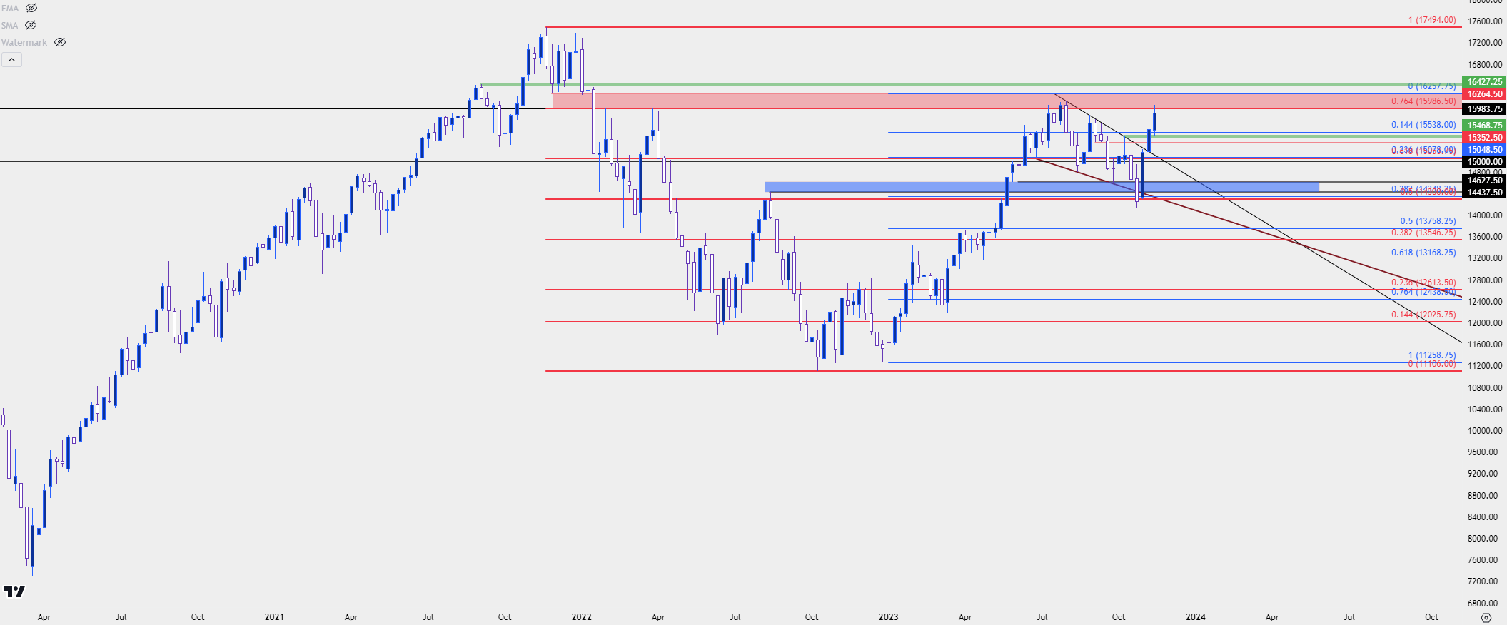
As a case in point, the Nasdaq has been up by as much as 13.5% - in less than three weeks. The index is now testing a vaulted spot of resistance that had held the highs in July, and this is taken from a support zone that came into play before the index turned in early-2022 trade. If bulls can take this out, the next spot of interest would be a re-test of the all-time-high in the index.
Nasdaq Weekly Price Chart (indicative)
 Chart prepared by James Stanley; data derived from Tradingview
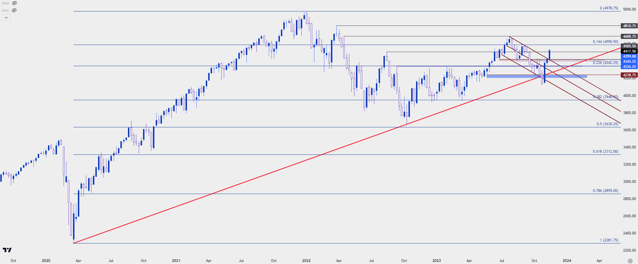
The S&P 500 has so far seen a more modest 10% bump in the past few weeks as the index re-approaches some key resistance.
As of this writing the S&P 500 is trying to hold above the 4500 level, which was a key level of resistance that was run-through on the morning that CPI was released. This may take some time to play out as that’s a big level facing its first test in a couple of months. If buyers can hold a higher-low, the stage is set for a push into resistance at 4688, and that’s followed by 4810.
S&P 500 Weekly Chart (indicative)
 Chart prepared by James Stanley; data derived from Tradingview
The US Dollar
There’s often a confusing relationship between the US Dollar and Treasury yields so I’d like to address that up front.
The weekly chart below is of 10 year Treasury yields, and at bottom I have the correlation coefficient representing the relationship between 10 year yields and the US Dollar. Notice the inconsistency, where at some points a direct relationship will exist and then, at others, the indicator is near the zero level indicating no relationship at all.
As such, I treat each market individually as resting on correlations can be a recipe for disaster.
US 10 Year Treasury Yields with Correlation Coefficient to the US Dollar (indicative)
 Chart prepared by James Stanley; data derived from Tradingview
In both cases for 2022 and 2023, US Dollar strength drove through much of September trade. And then the currency stalled for all of October, with a slight tinge towards bearish behavior. Bears then feasted in November after the release of CPI. Last year that took place on November the 10th, this year that showed on November 13th.
In both cases, a below-expectation CPI print brought the USD bears out in droves and allowed for a significant breakdown of the prior trend. The difference, at this point, is we’ve had more hindsight to see the results of last year’s episode while this year’s iteration is still in the very early stages. And last year did present another item of potential opportunity for bears that I’ll address after the next chart.
US Dollar Weekly Price Chart (indicative)
 Chart prepared by James Stanley; data derived from Tradingview
Will the US Dollar Follow a Similar Script?
This is where the plot thickens, and this is why I wanted to begin this section in addressing the correlation (or lack thereof) between the US Dollar and Treasury prices or yields.
The US Dollar is a composite, made up of underlying currencies. The Euro plays the largest role with a 57.6% allocation into the DXY, so for many matters related to the USD, the Euro plays a part. Treasuries are not in that composite, nor is Gold or the S&P; its just currencies, so for relationships and especially correlations, traders should remain cautious of comparing the US Dollar to other assets or markets.
What made the sell-off in USD last year so pronounced was the European Central Bank starting to lift rates; and as markets were looking on the horizon with softening inflation in the US and an ECB that had just started their rate cycle, there was an attractive picture to push for the reversal in EUR/USD.
But – this is where things have changed. The ECB has probably finished hiking rates and comments from prior ECB President, Mario Draghi, indicate that there may be expectation for recession to set-in by the end of the year. This would become evident in European economic data in the first-half of next year, but that continued shift in expectations could prove as a hindrance for USD bears.
So, the big question is whether USD bulls show up at nearby support points to try to push for the bullish move. For this morning, we’re seeing a bounce from a prior swing at the 104.03 spot; but it’s the 103.50 area that seems important here. That’s the 50% mark of the bullish move that began in July, and its confluent with a couple of prior swings that built a double top formation, ahead of the July breakdown.
Above current price is a massive zone of interest, spanning from 104.70 up to 105; and if bulls can push back-above this spot the prospect of topside continuation will start to look more attractive.
US Dollar Weekly Price Chart (indicative)
 Chart prepared by James Stanley; data derived from Tradingview
How to Stay on Top of These Constantly Shifting Factors
I’ve covered a lot in this article and there’s still more that can be said. If you’d like to visit with myself or my team, we host webinars every week in which we look at these matters in significant depth.
My webinars are hosted on Tuesdays at 1PM Eastern Time, and you can register for those for free from the below link:
Register for the Price Action Webinar
My colleague Michael Boutros kicks off the week with the Weekly Strategy Webinar, taking a close look at technical items and how those might impact price flows in the week ahead. Those webinars are hosted every Monday at 8:30 AM ET.
Register for the Weekly Strategy Webinar
My colleague David Song takes a close look at fundamental analysis and macro-economics, and he hosts his webinar every Wednesday at 10 AM ET. You’re welcome to register for that session from the below link:
Register for the Weekly Fundamental Market Outlook
--- written by James Stanley, Senior Strategist


